
- cross-posted to:
- buyeuropean@feddit.uk
- cross-posted to:
- buyeuropean@feddit.uk
from the team:
Hi everyone,
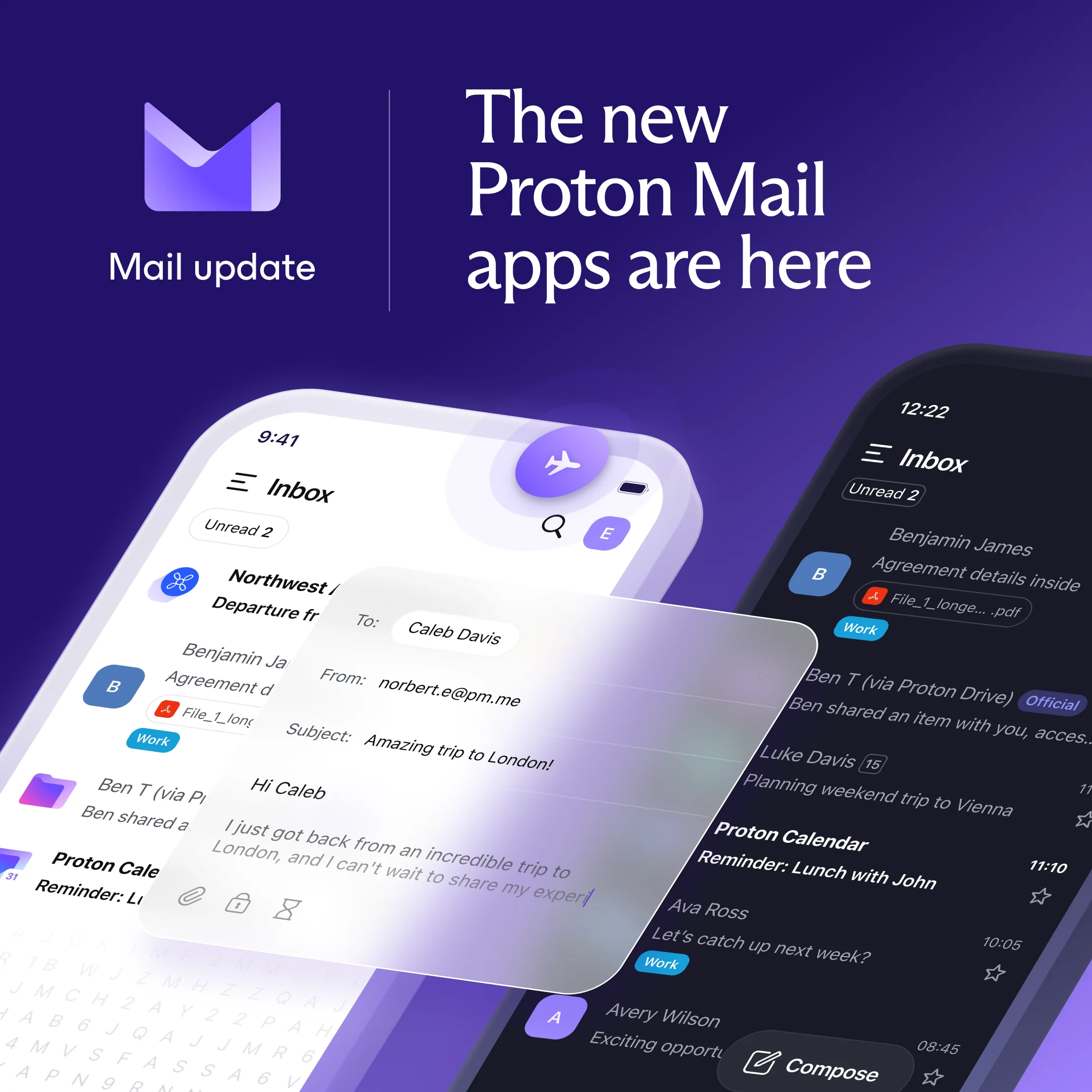
We’re excited to announce that the new Proton Mail apps for iOS and Android are now available.
We’ve listened to your feedback, and this release is designed to address your needs and improve your experience.
Here’s what’s new:
- Faster performance: emails open quicker, routine actions, like scrolling your inbox, archiving threads, or replying on the go, all feel instant, and the overall app is more responsive.
- A modern design: managing your inbox is now easier thanks to a refreshed interface with simpler navigation.
- Offline mode: read, write, and organize emails without an internet connection. Changes sync automatically once you’re back online.
- Feature parity: iOS and Android now share the same features (such as snooze and schedule send), with updates rolling out in sync across both platforms.
On the technical side, the apps now share ~80% of their code thanks to a new architecture built in Rust.
Getting the update:
On iOS: you can update manually from the App Store.
On Android: the new version is gradually rolling out on the Play Store.
Read the full story here: https://proton.me/blog/new-mail-apps
This milestone wouldn’t have been possible without all of you, the Proton community. Thank you to everyone who tested early builds, reported bugs, and gave feedback. You’ve been a huge part of this journey.
You must log in or register to comment.
I don’t know if its only me, but this new fucking app blocked me out of mail. Just because there is a unskippable getting started message on startup. You have to press “next” 2 times, and then pressing the last button causes infinite loading. Tried clearing cache, memory, force stopping, logging again nothing fixes, so yeah. I’m so annoyed by this, because they did not add the skip button and forced me to read some shit and press next button to finally end with infinite loading. Cannot swipe it down, if though its swipeable…
Does anyone else who has NextDNS see the google DNS showing up on tracker logs after updating the Proton app. The tracker shows up right after the Proton entry several times.
Github will be available in the upcoming weeks, an APK version might be available sooner.
Source: https://old.reddit.com/r/ProtonMail/comments/1np7knu/new_proton_mail_app_just_released/ng3ikl1/
edit:
Android source code and APK is already on github:
Only the APK is on GitHub, source code is still from the previous release. They say it will be “available at a later time” but knowing Proton that could take a while.
I got a notice through my rss from Github this morning. I installed the new version from an apk.
Please better linux implementation for the VPN gui next!
oh my G** this is so desperately needed
What’s the status with the F-Droid port? Are you working on it? It would be great to have the full Proton suite in F-Droid.
It’s also worth noting that Proton Drive still has no Directory synching (only for photos and videos) on Android. I have to upload backups as zips…
Lack of fdroid and Linux support is a bit part of why I’ve not switched
I guess it’s good to have a new version made in Rust, but the new UI is worse IMO, with the app trying to guess profile pictures and e-mail rows being wider, the inbox looking less compact. Also, the dark theme is lighter and more colorful. The worst about all of this is that you can’t change any of it.
I don’t see the faster performance either - the last version was quite snappy on my device (with good connection) and now the settings menus take some seconds to load.
I’ve seen the notification option…do we have new e-mail notifications if one doesn’t have Google Play Services?
Also…fdroid release wen
Notifications… I think it’s still using google services. I tested and didn’t get any notification. (Unless there’s a setting I missed that prevented it)
I updated to the redesigned Android app this morning and reported this bunch of bugs and weirdnesses to Proton support. I’m using Proton Mail v7.0.10.
No compact view?
The app view contains more dead space than before. I’d like to see a ‘Compact view’ in the Settings that could allow me to not see file names and customised sender icons in the main app overview: to me, those things are distracting and doesn’t really help me. I can see how that would help others, but it doesn’'t help myself.
Weird and unorthographic line spaces
Writing an email, I hit the enter key and it seems I’m getting more space between paragraphs than I should get. Example screenshot:
I hit enter twice after the top line of text. It looks like I’ve hit enter three times.
Then, if I hit enter just once, there’s weird space inserted between every line where space should not exist. This behaviour is also shown in the image.
A single enter stroke should not create what seems like a new paragraph, only a new line. This is either a bug or a feature that went very wrong.
I wonder how this email looks like to the recipient, which is bad UX.
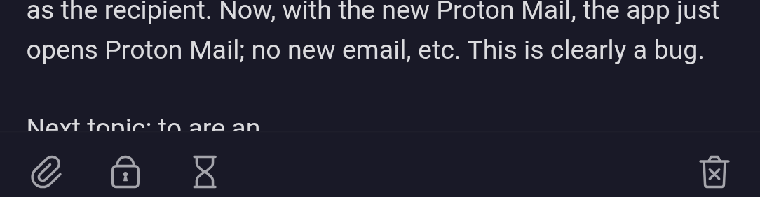
Web browse > select an email address > just opens Proton Mail, not a new email
I web browse, select an email address, and choose to send an email via Proton Mail. What happened before the upgrade to the new Proton Mail was that a new email was created (and displayed in the app) with the email address that I’d selected as the recipient. Now, with the new Proton Mail, the app just opens Proton Mail; no new email, etc. This is clearly a bug.
Bug or weird UX redo: adding images
To add an image adds an image inline. I can’t choose to just attach an image to an email. It’s nice to now be able to add images inline via the new app design, but this behaviour is strange. How should this work? Weird UX.
Another thing about adding images: when I select the paperclip icon, ‘From your photo library’ seems weird to say. Images can be of other kinds than photographs and I do not attach images solely from my photo library.
The app cuts off the line where I’m writing
While writing an email, the app cuts off the line that I’m writing. Example:
When replying to an email, an extra select is required to be able to write
When replying to an email, this is what I see:
I can’t just start writing; I’m forced to select the ellipsis icon and then write.
This is most likely a bug.
Don’t really feel a difference. Thankfully they didn’t ruin the design (stares at Authenticator).
Android or iOS?
On my Android it’s much quicker at everything
I know this has been in the works for a while so I’m glad its finally out, and I’m sure future updates will move faster with a mostly uniform back end.
Usage is fine. Navigating does seem faster. Switching between email folders is still slow (maybe slower?) But once an initial load in switching between them is fast.
UI is good and keeping with the general branding/design.
I don’t see a way to customize appearance, such as font size etc. Text is larger that previously, which is nice but I think it’s too large. I’d like to adjust to an in between state.
Also as another has noted, I’d like to get away from google play services for notifications.
Damn! That’s much faster.
Yet they still didn’t fix the “you have mail according to the app badge, but have to pull to refresh because we can’t figure out background refreshing” issues on iOS.
To be fair, a lot of iOS stuff is a challenging, moving target.
This is value add. Glad to see it!
New app is fast but the new UI lacks contrast.
Hmm. I know Proton isn’t perfect, but I may make the switch just so I can begin truly de-googling myself. They really do seem to be covering all the bases.


