fossilesque@mander.xyzM to Science Memes@mander.xyzEnglish · 21 days agoWho the fuck needs an x axis anywayimagemessage-square162linkfedilinkarrow-up1507arrow-down17
arrow-up1500arrow-down1imageWho the fuck needs an x axis anywayfossilesque@mander.xyzM to Science Memes@mander.xyzEnglish · 21 days agomessage-square162linkfedilink
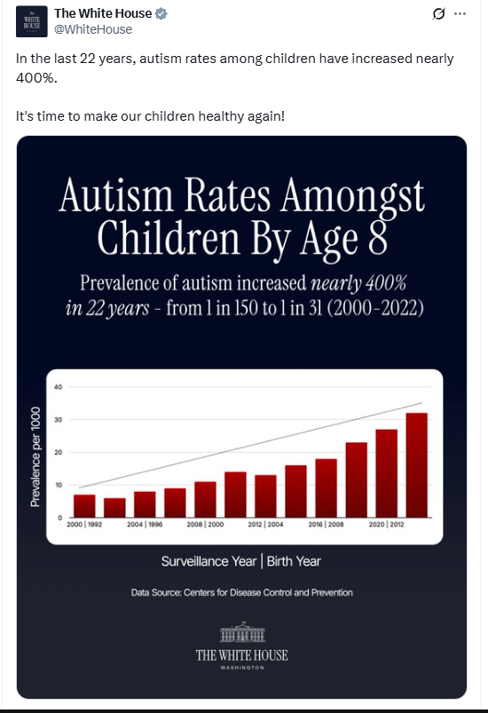
minus-squarebleistift2@sopuli.xyzlinkfedilinkEnglisharrow-up21·21 days ago2012 appears once as a birth year and once as a surveillance year. The graph says that they only ever surveyed 8-year-olds, since the birth year is always 8 less than the surveillance year.
minus-squareJoeffect@lemmy.worldlinkfedilinkEnglisharrow-up4arrow-down2·edit-221 days agoBut they have 12 bars and 6 labels… it makes no sense
minus-squarebleistift2@sopuli.xyzlinkfedilinkEnglisharrow-up3·edit-220 days agoI see 6 labels. I guess that means 2 surveys per year. But I’m just guessing.
minus-squarejacksilver@lemmy.worldlinkfedilinkEnglisharrow-up4·20 days agoIt’s probably a dataset that collected every 2 years, but only labeled every other bar to prevent the graph from being overcrowded. Not a great decision, but not terrible. Although, I’m a bit concerned for Lemmys graph comprehension skills.
minus-squareJoeffect@lemmy.worldlinkfedilinkEnglisharrow-up1arrow-down1·21 days agoYour right I can’t count i guess still makes no sense


2012 appears once as a birth year and once as a surveillance year. The graph says that they only ever surveyed 8-year-olds, since the birth year is always 8 less than the surveillance year.
But they have 12 bars and 6 labels… it makes no sense
I see 6 labels.
I guess that means 2 surveys per year. But I’m just guessing.It’s probably a dataset that collected every 2 years, but only labeled every other bar to prevent the graph from being overcrowded.
Not a great decision, but not terrible.
Although, I’m a bit concerned for Lemmys graph comprehension skills.
Your right I can’t count i guess still makes no sense