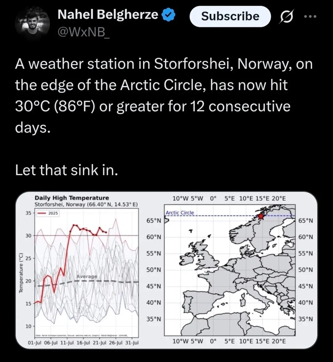
That graph has just one month of data. For all we know it could be a regular occurance for this month. And equally low on the opposite side resulting in the average.
That said. Duh, even many republicans agree the climate is changing. They just argue tha we didn’t cause it. Like that will really matter when we are all dead from doing nothing.
All the other lines are past years, and the dotted one in the middle that says “average” means the average of all the lines. So, isn’t a regular ocorrence.

Lies, damn lies, and statistics.
That graph has just one month of data. For all we know it could be a regular occurance for this month. And equally low on the opposite side resulting in the average.
That said. Duh, even many republicans agree the climate is changing. They just argue tha we didn’t cause it. Like that will really matter when we are all dead from doing nothing.
All the other lines are past years, and the dotted one in the middle that says “average” means the average of all the lines. So, isn’t a regular ocorrence.
Is there something on there that I missed which says what the other lines are?
Your high school class were they teach you how to interpret graphics
Mine taught me to clearly label my graphs.
12 consecutive days is definitely less than a month, yes
Not on Mercury